
An identity grounded in nature
Challenge
Te Ohu Kaiwharawhara (formerly ‘Every Business Restoring Nature’) is a collaborative business-focused initiative led by Zealandia Te Māra a Tāne with support from Kia Mouriora te Kaiwharawhara strategic partner organisations and independent volunteers. The initiative aims to improve the health of the local Kaiwharawhara catchment by delivering projects that enhance its awa, ngahere, and te tangata of Te Kaiwharawhara whaitua.
StudioC were tasked with creating a brand identity that would encourage businesses within the catchment to engage with the work, and provide a way for them to share their involvement via branding.
This project required a multi-layered approach, including:
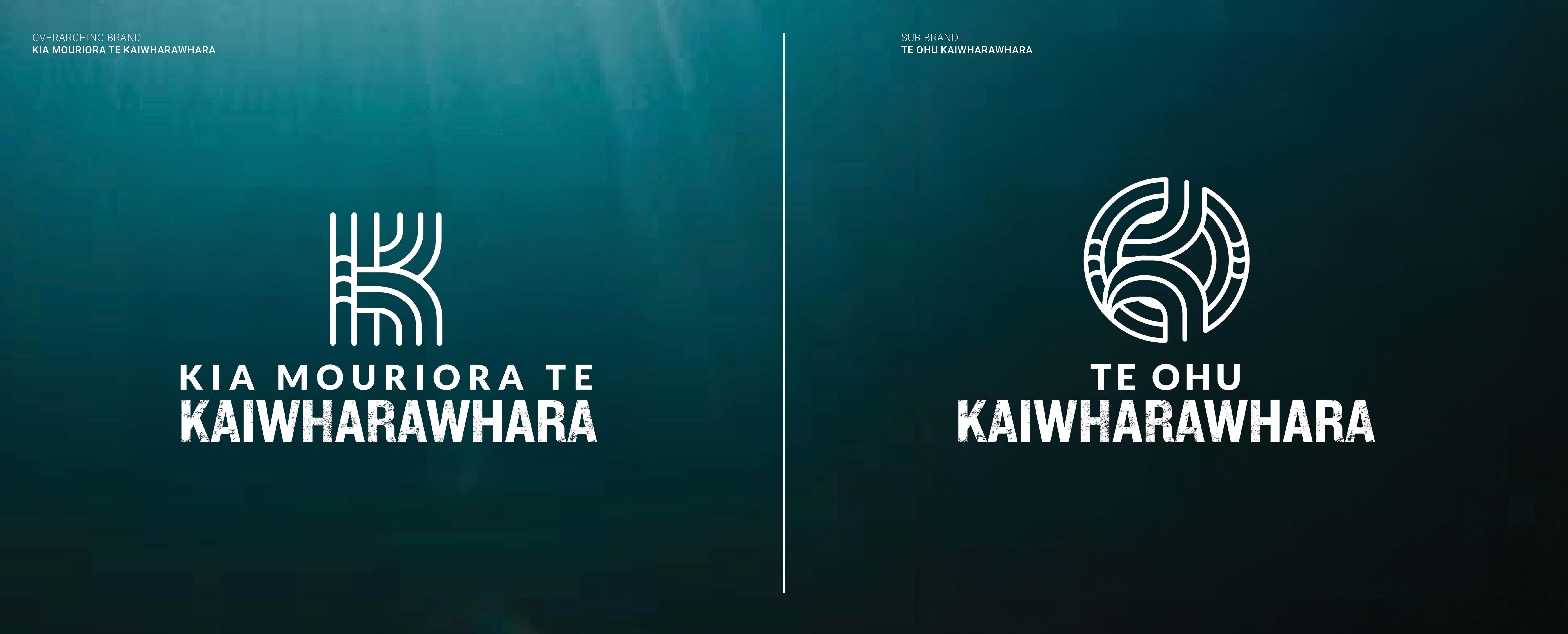
- the overarching brand: Kia Mouriora Te Kaiwharawhara
- a sub-brand that would reference the collective who are caring for the kaiwharawhara: Te Ohu Kaiwharawhara
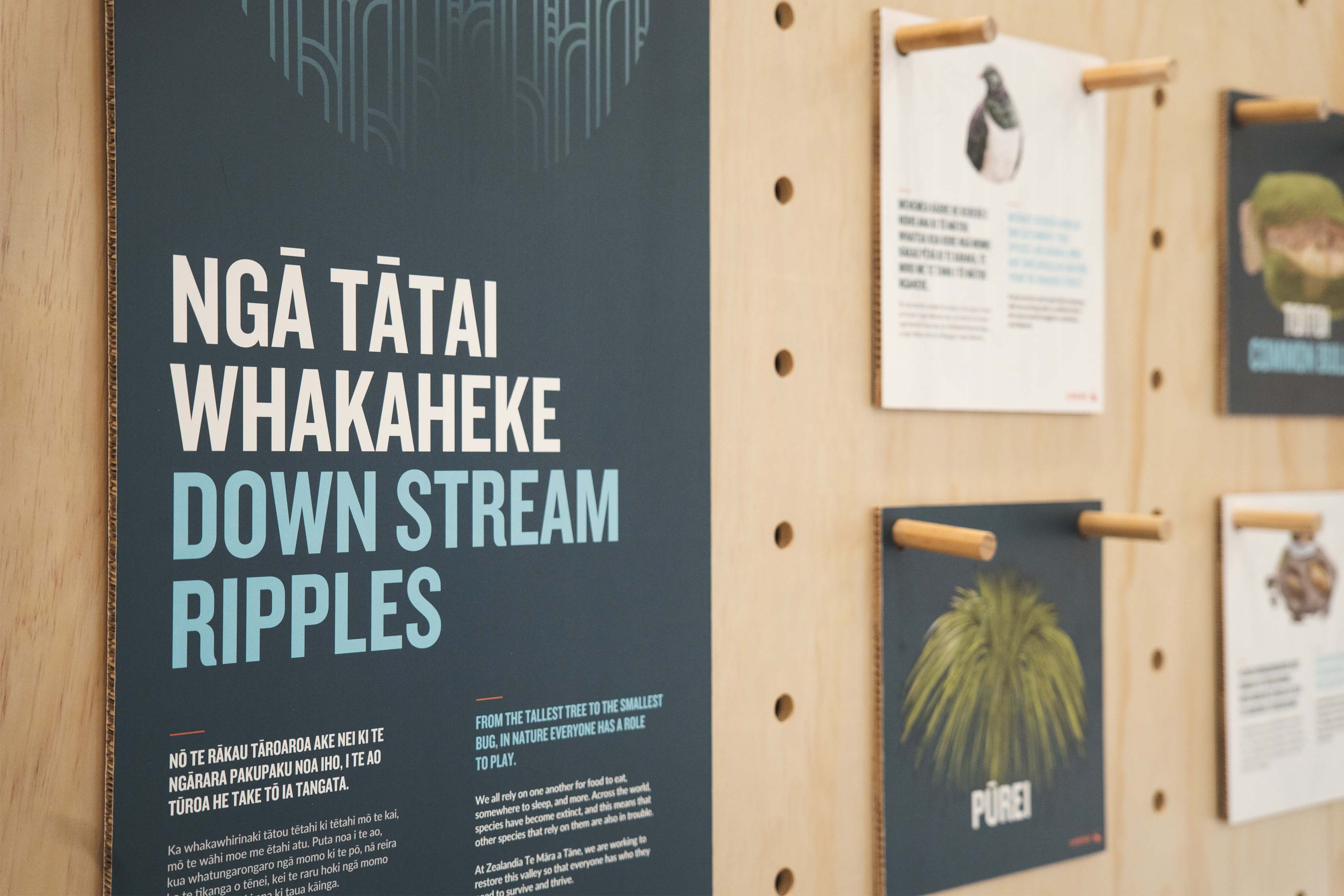
- a new slogan, inspired by the whakataukī written on the mouri stone inside Zealandia Te Māra a Tāne: ‘Whatungarongaro te tangata, toitū whenua / As man disappears from sight, the land remains’
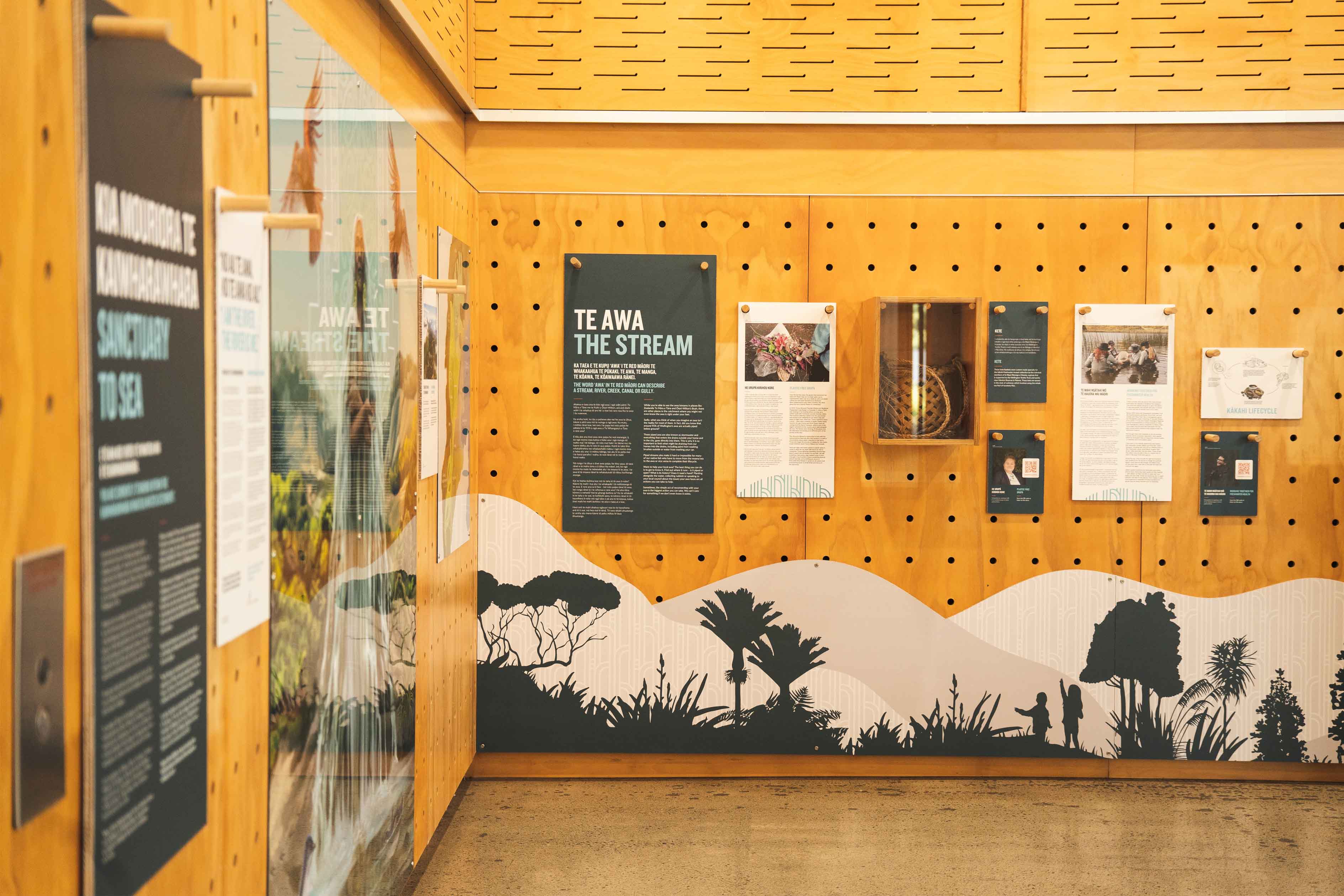
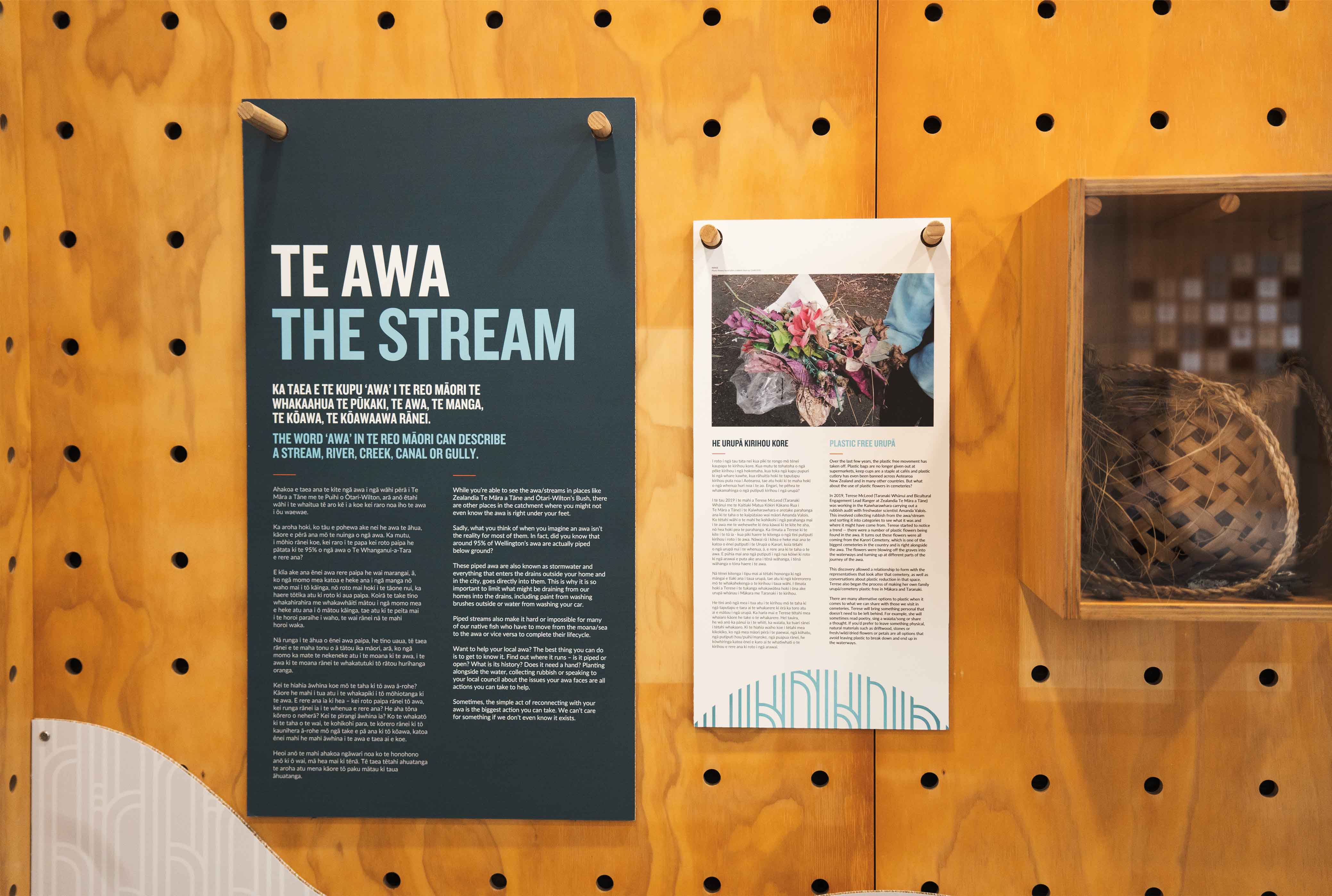
- incorporating the new branding into a foyer exhibition for Zealandia.
Our solution
Inspired by the whakataukī, we drew inspiration from the natural elements in the area. The identity reflects ngahere (forest), wai (stream), rangi (sky), and the wharawhara plant, which lends its name to the Kaiwharawhara catchment. Traditionally used in raranga (weaving), the plant became the guiding metaphor for the umbrella brand, demonstrating how shared efforts weave together to create lasting impact.
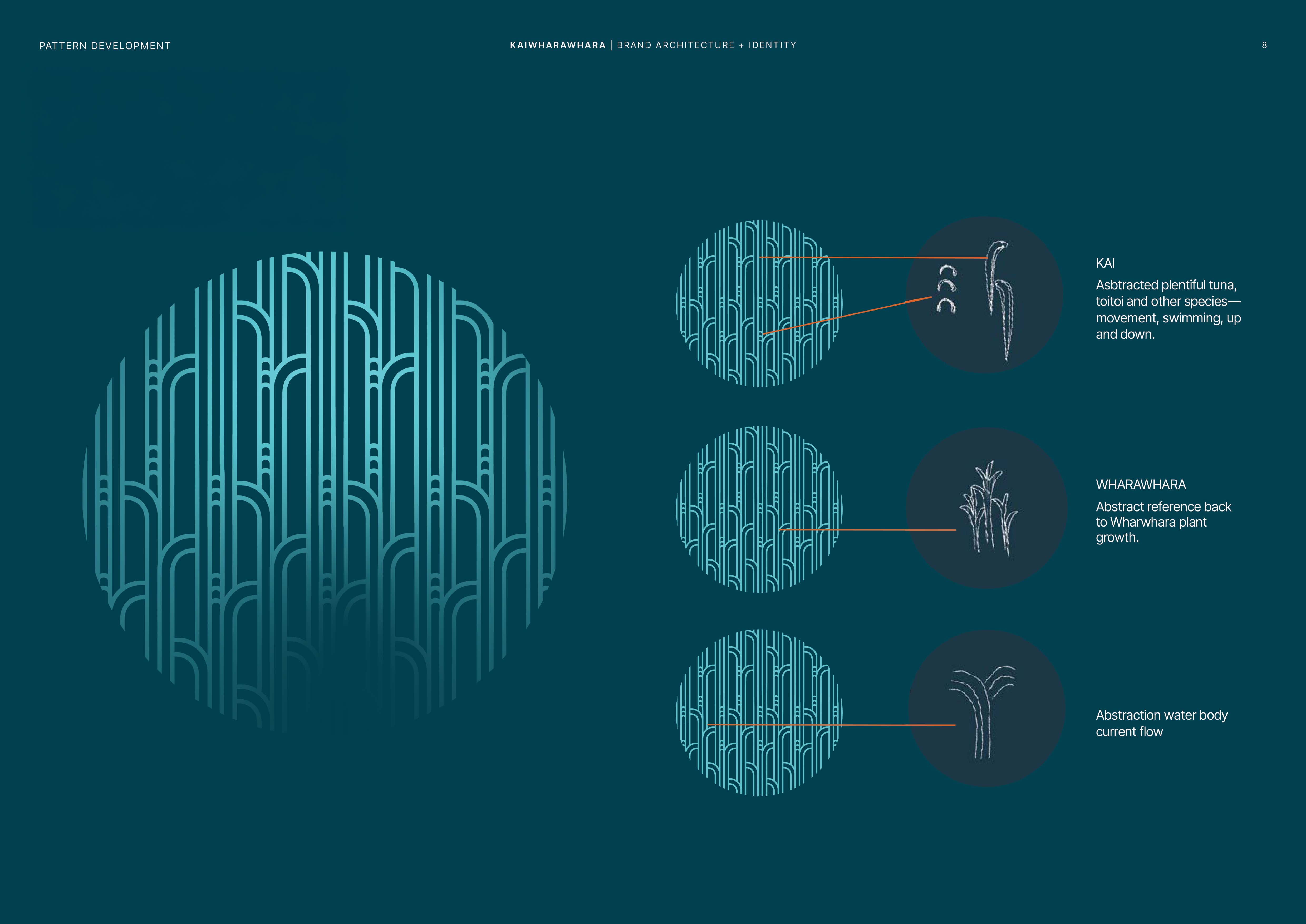
Pattern became a key part of the design system, following the rule of three as a subtle nod to Māori culture, while weaving the core elements together. The pattern drew on the shapes of the wharawhara plant’s growth, the curves of native eels and their movement, and lines reflective of the waterway’s flow.
Once we created the pattern, we hosted it in a circular form to represent the concept of toitū (to sustain consistently). Both the umbrella and sub-brand identities use the pattern in their logo marks and feature notches reflective of the catchment’s toi toi fish.

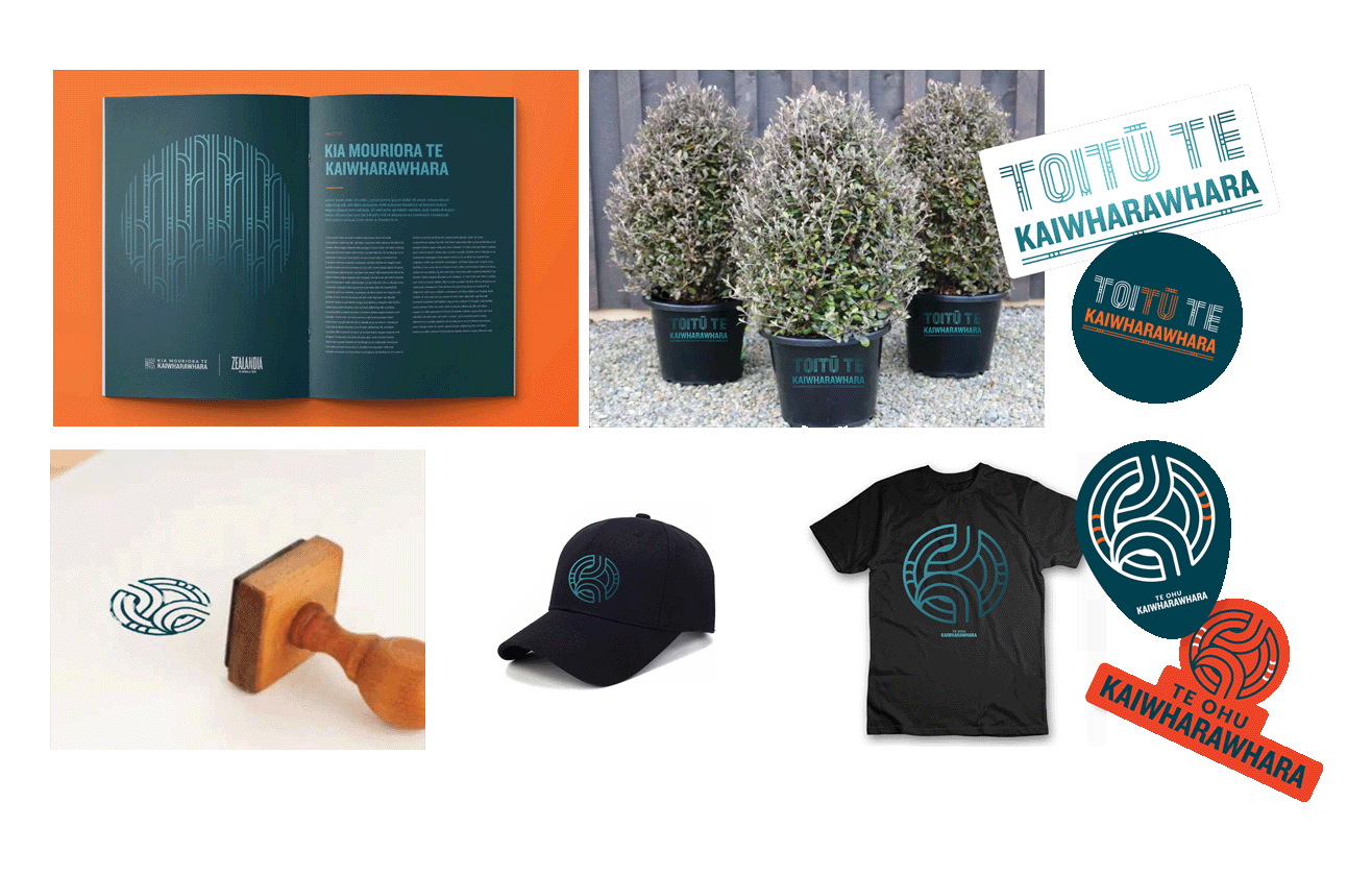
We crafted a colour palette that drew on the deep blues of the wai (water) and lighter blues from freshwater. Occasional pops of orange from Zealandia’s identity are used to connect back to the leaders of this kaupapa.
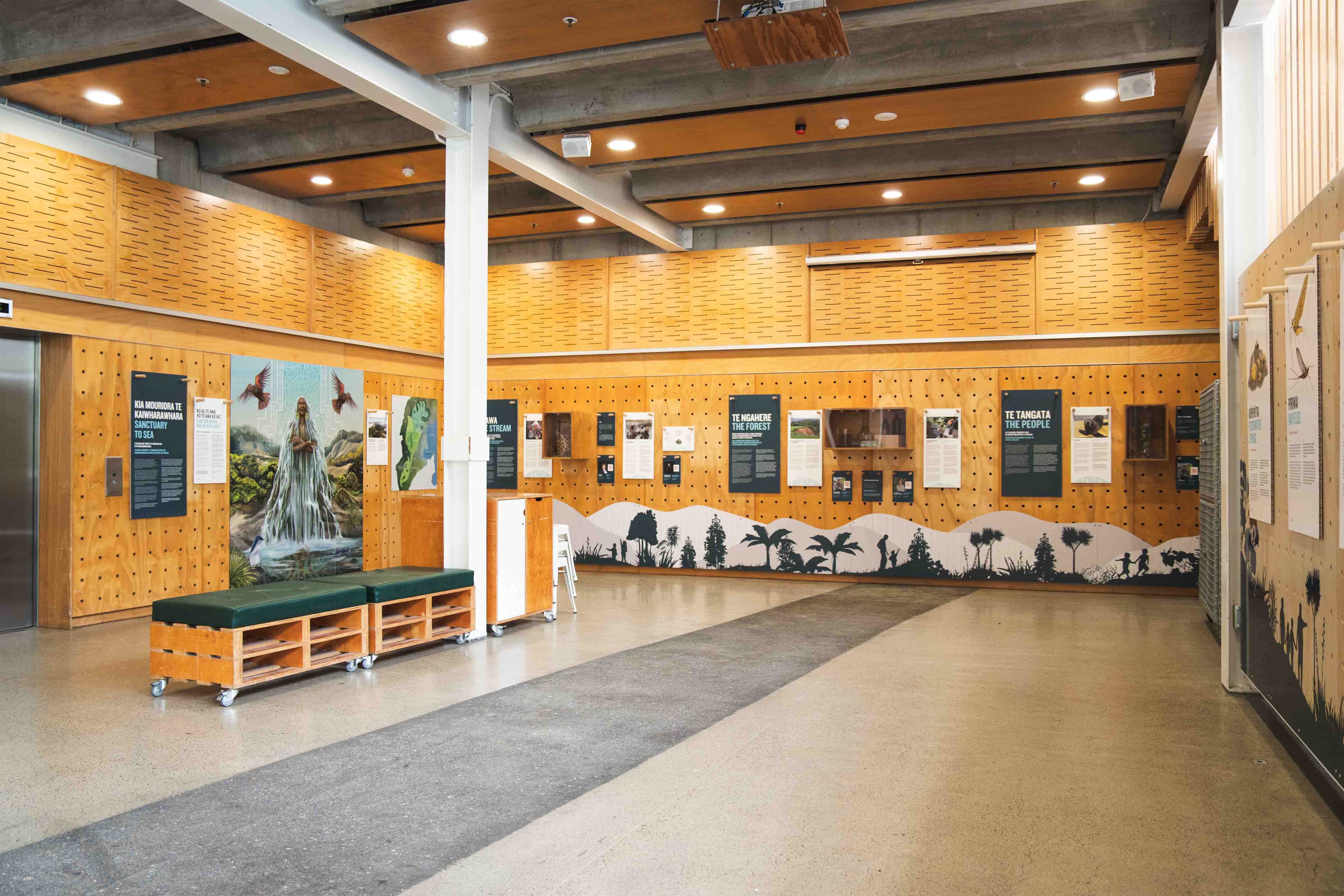
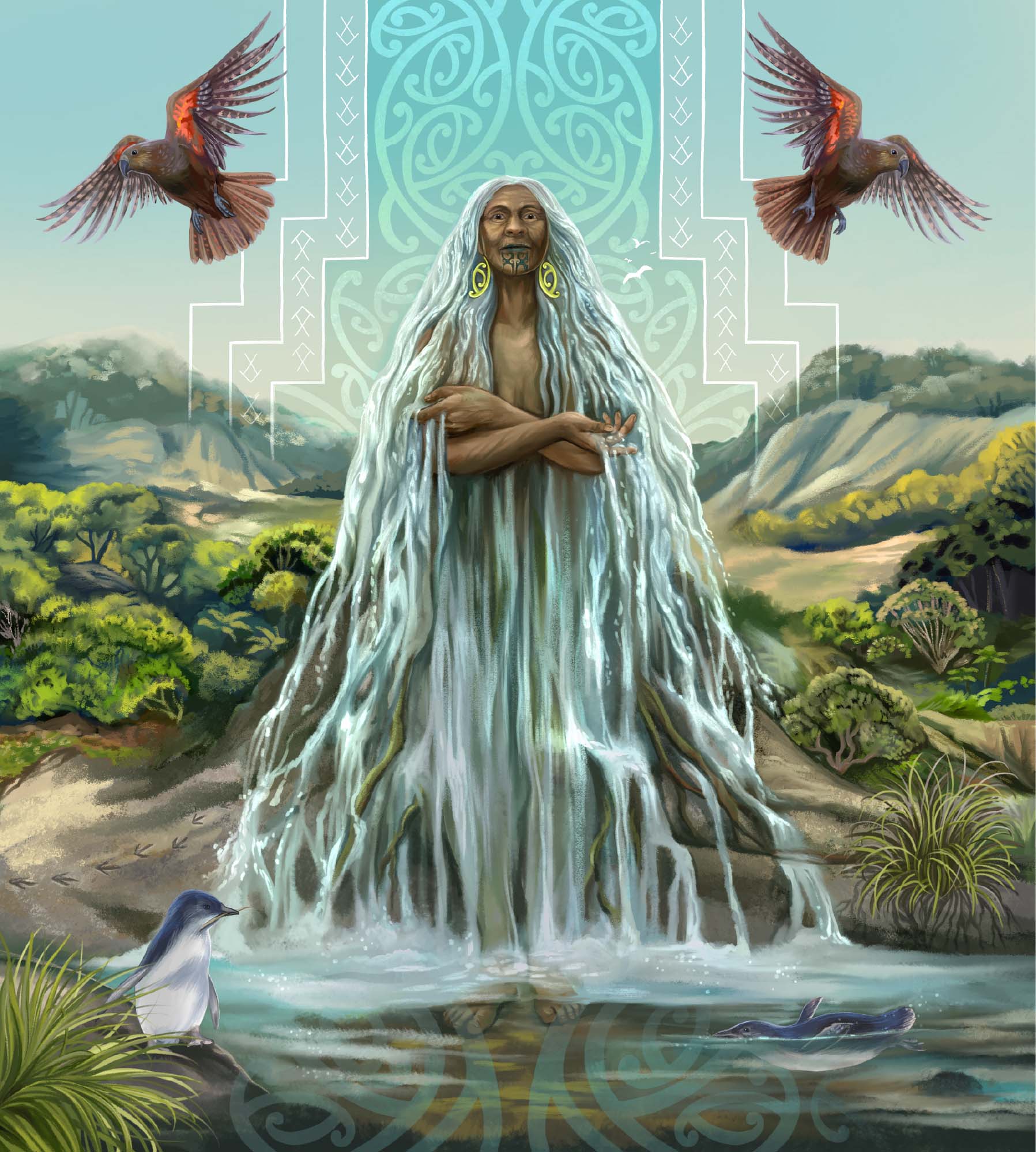
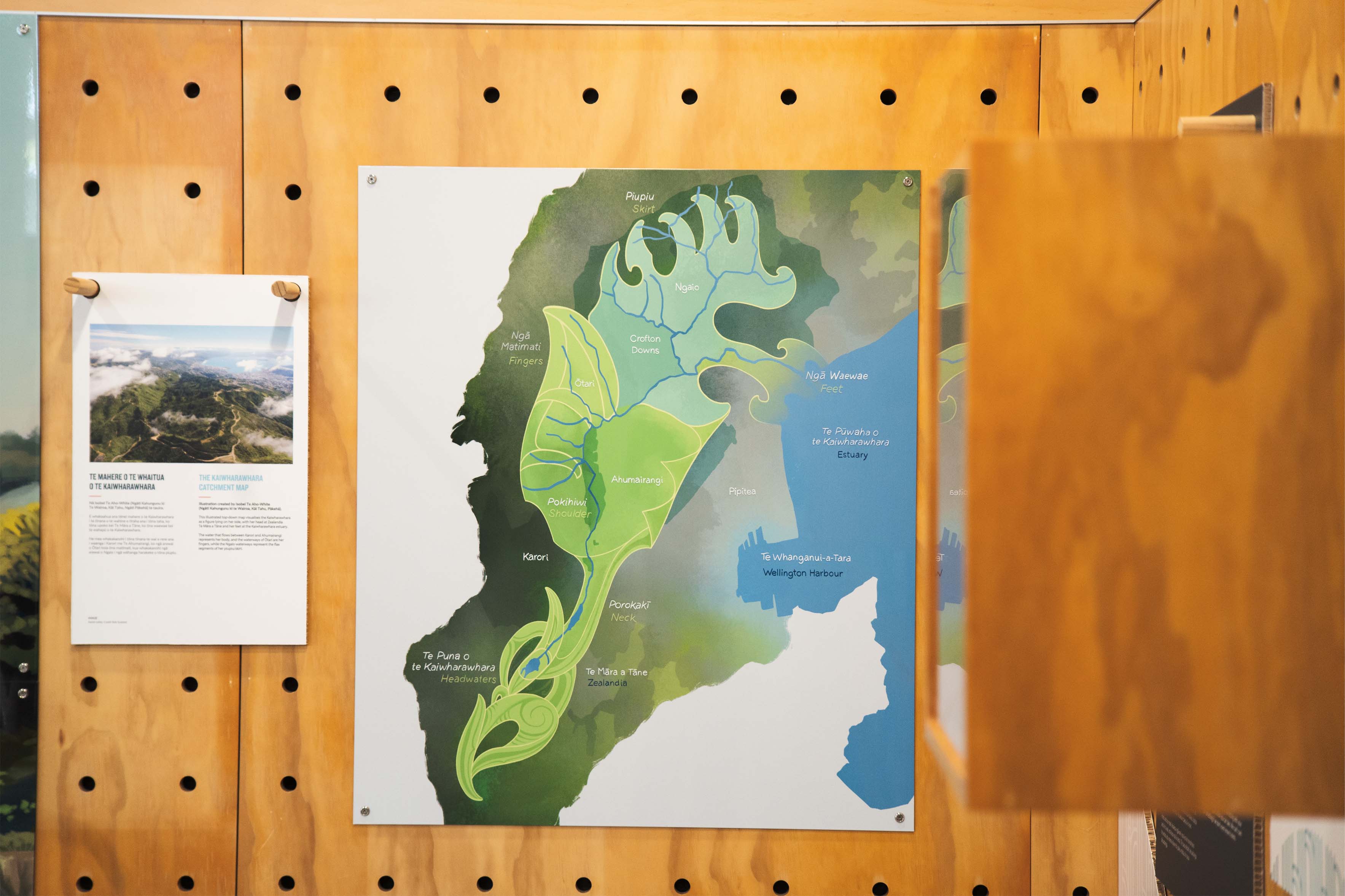
To bring the new identity to life, we refreshed the Zealandia Kia Mouriora te Kaiwharawhara foyer exhibition. Illustrator Isobel Te Aho-White created a stunning mural, visualising the catchment as a kuia (elderly woman) with waterways flowing through her. Her strong presence was supported by audio stories that could be accessed with QR codes, using influential Kia Mouriora te Kaiwharawhara voices.
Impact
The new brand identity captures the essence of the restoration initiative, providing a strong visual anchor for businesses, communities, and partners. Zealandia says that the approach we took worked well given the large number of people invested in the branding and exhibition, by providing the space for everyone to offer ideas and including as many of these as possible in the new brand. The brand identity has also fed into Zealandia’s new brand colour palette and website concepts.
Client feedback
Zealandia Te Māra a Tāne
“The result is a brand suite that our organisation is proud of and our team loves to share, as well as an exhibition that draws visitors in to learn about a kaupapa outside of the Zealandia fence.”
Sam Irwin - Marketing and Communications Manager, Zealandia Te Māra a Tāne

