
A design journey guided by nature
The Challenge
Ngā Manu is a wildlife reserve on the Kāpiti Coast, dedicated to conserving New Zealand’s native flora and fauna since 1974. Despite its vital conservation work, the reserve faced challenges in how it communicated and connected with its visitors and stakeholders.
StudioC took a multi-staged approach, working side-by-side with Ngā Manu on everything from strategy to brand refresh, to designing and building an interactive learning experience.
There were three key areas of the brief:
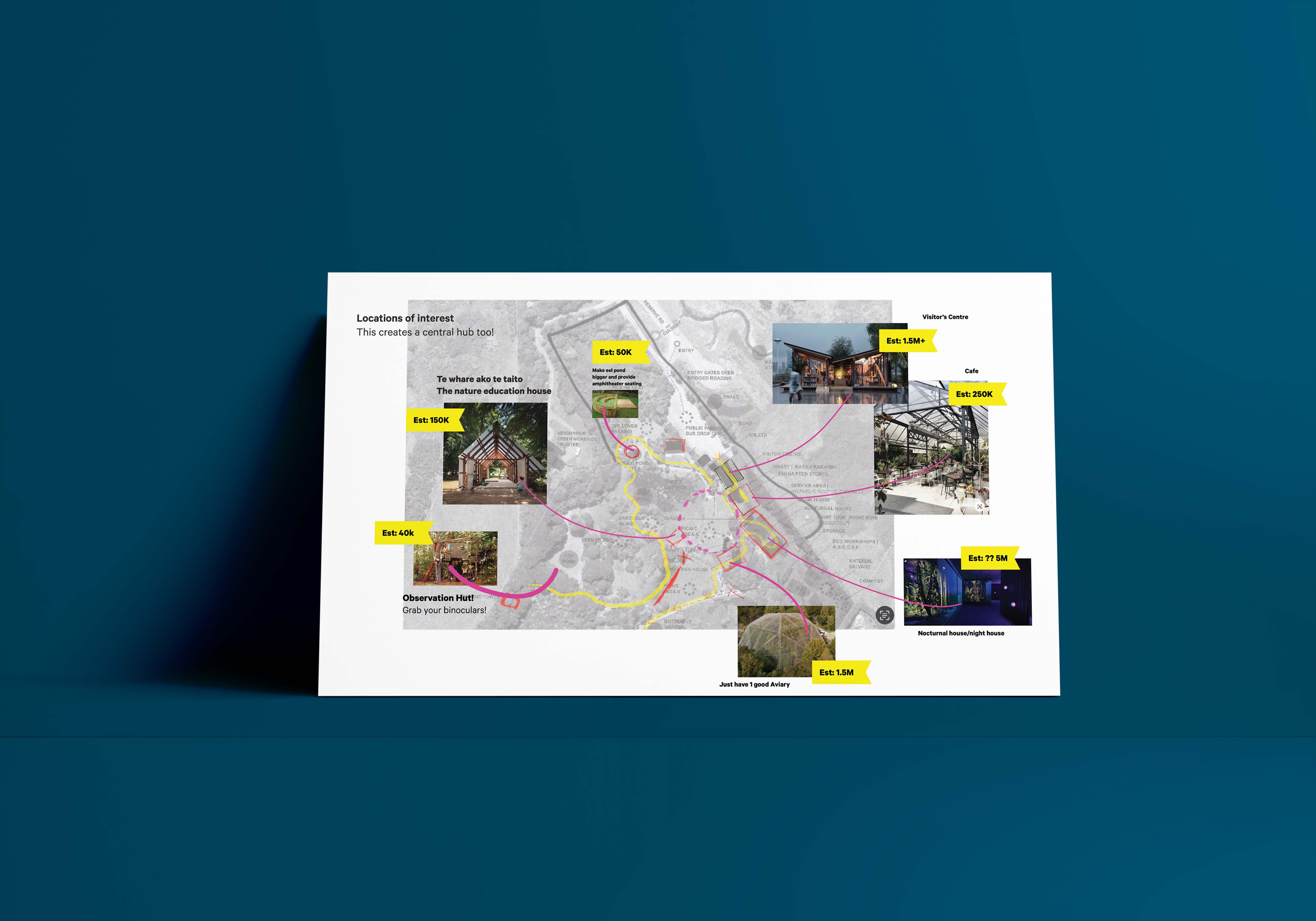
- Reimagine the overall visitor experience.
- Modernise the brand identity without losing its rich history.
- Translate the new brand into meaningful, educational moments for young and old alike.
.jpg)
.jpg)
Our solution
What began as a strategic project to re-envision Ngā Manu’s future grew into a full journey, from insight gathering and long-term planning to brand refresh and a kererū poo interactive.
Strategy
We began by aligning stakeholders with a one-page summary of Ngā Manu’s existing work and ambitions. Through on-site interviews and observations, we uncovered opportunities to improve the visitor experience. These insights shaped a simplified journey through the reserve, leading visitors on a journey from Aotearoa’s natural past, through present challenges, and into a hopeful conservation future.
The result was a unified vision and 10-year strategy, complete with practical steps for signage, wayfinding, interactive zones, and key infrastructure. It gave Ngā Manu a way forward, bringing all of their stakeholders along together.

Brand evolution
StudioC kept close to the brand’s roots, retaining the piwakawaka (fantail) as the logo mark. We chose to update the logo with a typeface that is welcoming yet strong, much like New Zealand’s native flora. The custom ‘g’ evokes both a waterway and the curve of a swimming eel – a nod to a key species in the reserve.

The vibrant new colour palette was drawn directly from native birds that thrive in the reserve. Deep tui blue and kererū teal anchor the brand, while a supporting range of hues offers the flexibility Ngā Manu were after. A bespoke icon set was also developed to represent the reserve’s unique biodiversity and give options for brand expression across any medium or idea.
This refreshed identity became the foundation for everything that followed, including the first new visitor experience, Piki’s Perch.
Piki’s Perch
Ngā Manu’s identity refresh was immediately put to the test, with illustrator Zoe Gillett pulling from the new branding system and palette for a new display – Piki’s Perch – designed to educate tamariki and their whānau.
Starting with a photo moment introducing Piki the kererū and his whānau, children are guided via circular signage to a lookout perch. There, they can play a berry-feeding game and learn about the crucial role kererū poo plays in native forest regeneration.
The tone is playful, tactile, and grounded in learning – a physical expression of the strategic principles we developed months earlier. It is designed to spark curiosity, generate laughter, and inspire care for the natural world. It also offers fun photo opportunities, generating organic marketing for Ngā Manu and memories for all who visit.
The Impact
From big-picture strategy to hands-on design, Ngā Manu’s transformation is rooted in listening to the land, the visitors, and the team who stewards both.
The refreshed brand and first on-site activation (Piki’s Perch) now serve as a launchpad for the longer-term vision, where every touchpoint supports the mission of conservation through connection.
.jpg)
.gif)

.jpg)
Client Feedback
Ngā Manu board member
“I really liked how the exhibition content was written! Sometimes these things can get way too technical, but this felt so approachable. You could tell it was designed and written with families in mind. The language was easy to understand, even for kids. Using poo as the theme for the interactive was such a clever idea too and the kind of language my grandkids would love!”
Chriss Bull, Project Manager
“Your creativity has been amazing. The range of stuff you do – from concept development to implementing and construction – you are a one-stop-shop! I also appreciate you are genuine people. We didn’t come away from conversations wading through what was real and not real…You were also very responsive when we asked to do things differently.”
Ngā Manu Marketing Manager
"Piki's Perch is really well loved and the public seem to be enjoying the interactive side of it a lot!
Overall I think people really enjoy having something interactive up there and things to engage with! We are really happy with the feel of the lookout now and we've incorporated it into our Lil Explorer's Trail as well."


